Hi, my name is Lockie.
UI/UX Designer based on the South Coast, Australia.
Strategy | UI/UX Design | Design System
My practice & design thinking focuses on human-centred design; this philosophy empowers myself to design products, systems and experiences that address the core goals & needs of the user. I am familiar with the agile methodology & atomic design workflow.
Process & simplicity are core fundamentals that I value, I believe less is more. I believe people create better things together. Design matters at a deeper level & I see how media shapes the lives of individuals and the decisions of society — I think it can be better.
THE CANBERRA TIMES
A print-first news publisher undertaking a modern digital-first transformation. This has involved moving over to Figma as our preferred design platform & building a design system following atomic design principles.
EXPLORE TRAVEL
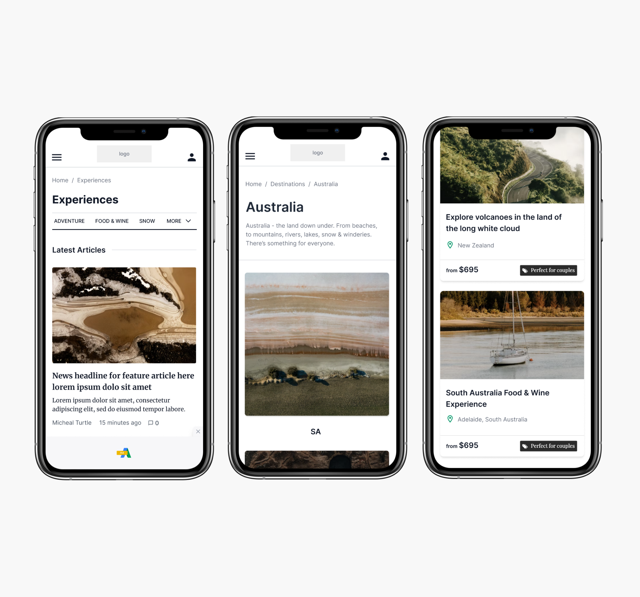
Explore Travel design process included; research, UX Design, UI Design, commercial strategy & working closely with the developers during the build. The site offers top travel stories, easy booking & secure transactions. Users can search by destination & discover a range of tour & accommodation offers.
PFIZER
The platform will house learning modules that pharmacists and health professionals will use to earn Continuing Professional Development (CPD) points through. A yearly quota of CPD points is required for many health professionals.
SAVANNAH MORROW THE LABEL
eCommerce solution for sustainable fashion brand; Savannah Morrow The Label. Building the Shopify store utilised UI/UX skillsets as well as the need for custom code & shipping/payment integrations.
ATOMIC DESIGN
Building a Figma design system.
- creating a style guide and component library.
- local variables
- variant components
PROPERTY CONCEPT
Property listings & birds-eye map view to support at all stages of the experience; buying, renting, sold & off market.
YES I CAN
Yes I Can is a site for motivation - for people of all ages in need. The site includes sections for; inspiring videos, travel blog, motivational quotes & more feel good content. One main feature is the ‘Be Fit’ section which includes a fitness module with video workouts for all levels of fitness - this gives users the option to get fit in their own time & where they choose.
SALTY LUXE
We initially setup the travel blog site with Wordpress. Then came the need for an eCommerce solution & this was managed by integrating Shopify. This project included content management, UI/UX, store setup & automations. We are often evolving the site design to better suit the Salty Luxe direction & message.
PERISHER APP
This application was designed for the public sector of the snow sports industry. The Perisher app with voice command allows for the unique ability to monitor your interface on the go. Designed to give users the ability to use the app without the need to take off their gloves. The app will provide the end user with information related to resort, trails, accommodation, events & tours. A set of back end systems & cloud services will form the basis of the business portal.
LUIGI’S ITALIAN RESTAURANT
Below are some sections of the design I proposed for an eComm project. I handled the UI/UX for the restaurant to uplift their online presence. My role was also to look into the possibilities for order & reservation automations, as well as a customised checkout for pickup/delivery options. The UI is minimal & was mainly focussed on the use of whitespace & imagery.
THE WORLD IS ROUND
The world is round website showcases creative and efficient solutions locally, nationally and internationally for clients requiring commercial, exhibition, retail, hospitality and residential architectural interior design.
LAW SOCIETY JOURNAL (LSJ)
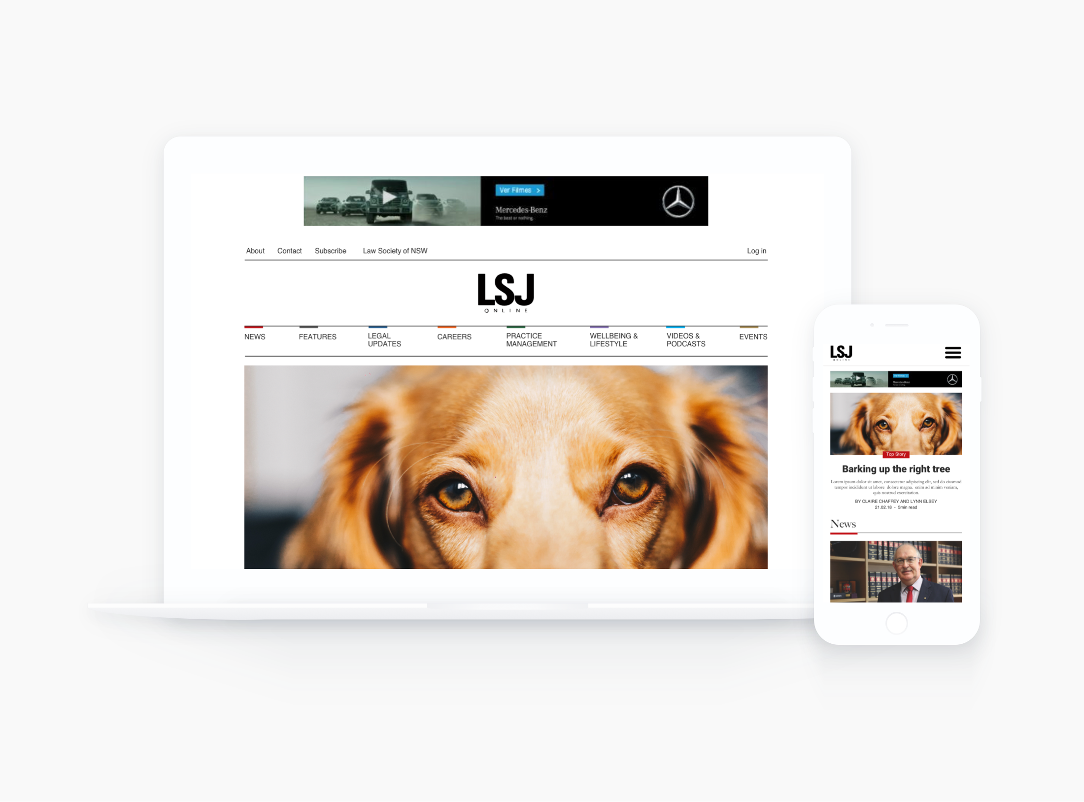
This project was for the Law Society of NSW, taking the Law Society Journal (LSJ) into the digital world. With a magazine-like layout I was to provide a solution for the journals articles & content. Dividing content into clear categories & giving users a readable interface.


